an organized communication experience


The purpose of this redesign is to make WhatsApp's current interface easier to navigate and understand.

To redesign WhatsApp's current interface to enhance its usability, making it measurably easier to navigate and understand for all users. Prioritizaion areas included:


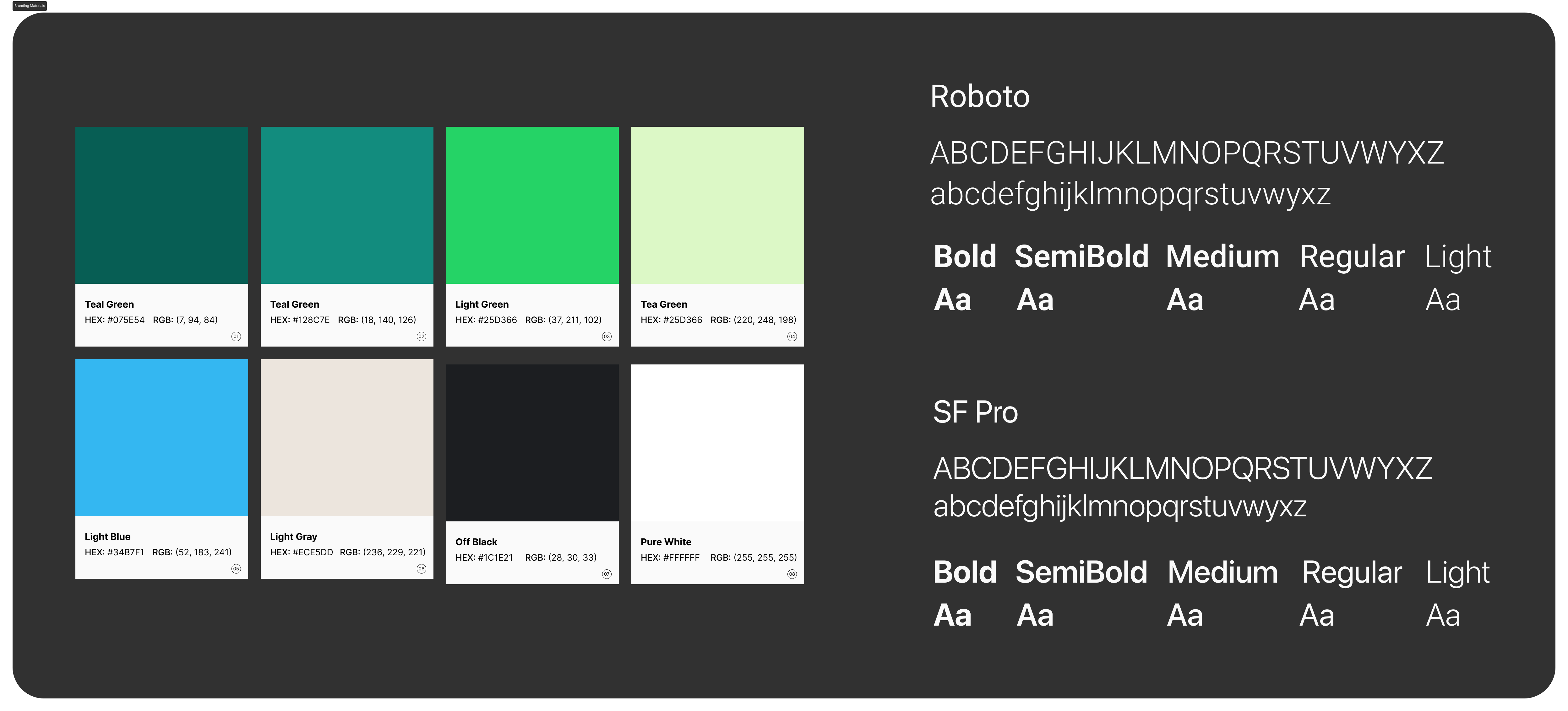
The current color palette on WhatsApp's interface is dominated by various shades of green (its primary brand color), white for light mode, and deep, dark tones for high-contrast dark mode.
For WhatsApp, the default typography is Roboto on Android devices and SF Pro (the default system font) on iOS devices.
NOTE: the redesigned interface was crafted with iOS devices in mind.

.jpg)
.jpg)
Communities and chats are consolidated into one tab area named “Activity.” Users can now find their individual chats, channel subscriptions, and group chats. A new “1:1” chip is also introduced to purely showcase private chats.
Swiping right on the message area will show options to pin, tag, or archive a chat.
Finally, a new “quick note” feature has been added to the chat for users to take quick snippets of key information from conversations.